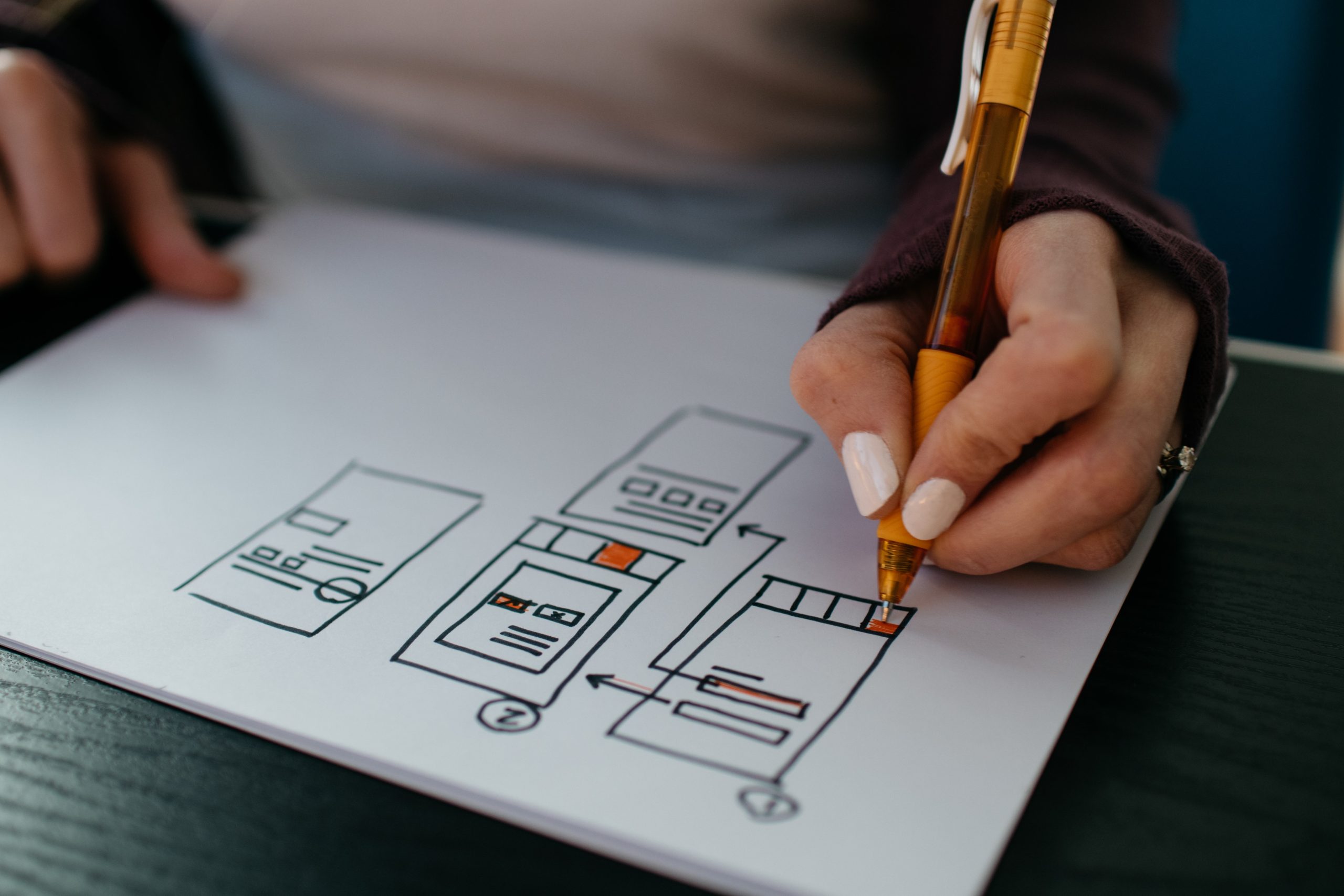
Web design is constantly evolving and our duty is to keep up with those changes if we want to stay relevant. In modern times wherein the internet industry everything changes overnight, website design is no different. If your business relies on website traffic, sales, or whatever else that directly correlates with the internet, then it is the main feature you can have to reach more customers and therefore create immense profit. That’s why it is important to have a modern, functional, and user-friendly place on the web that will work in your favor. To make sure you nail the website on the first try, working with one of the top web design companies on the market is recommended.
If you are just starting designing your first website, or you are just redeveloping an existing one, make yourself comfortable, this article is just for you. Later in the text, we are going to compile a comprehensive list of the most valuable elements your website needs to look modern. So, without further ado, let’s roll into this one.
1. Visual display
Let’s make it clear – we all like some nicely packed and readable websites rather than the overcrowded, color-mixed ones with unreadable fonts, stuffed with widgets and media that only slows the whole page down. Therefore, the visual presentation is the first step in gaining and keeping the visitor’s attention! You should be aware to keep it simple, yet professional. The minimalistic design will not only look good but it will put the focus on the most important part, product or service, on your website. From a psychological point of view, it is an advantage that helps attract the customer’s attention.
Modern Website.Design encompasses elements such as minimalist aesthetics, responsive layouts, and interactive features that not only enhance user engagement but also ensure optimal performance across various devices, resulting in a visually appealing and user-friendly online experience.
Remember – keep it simple! Don’t get distracted by silly and unnecessary gadgets that will just work against the website’s fluidity. Customers leave the page as a result of this.
2. Color schemes
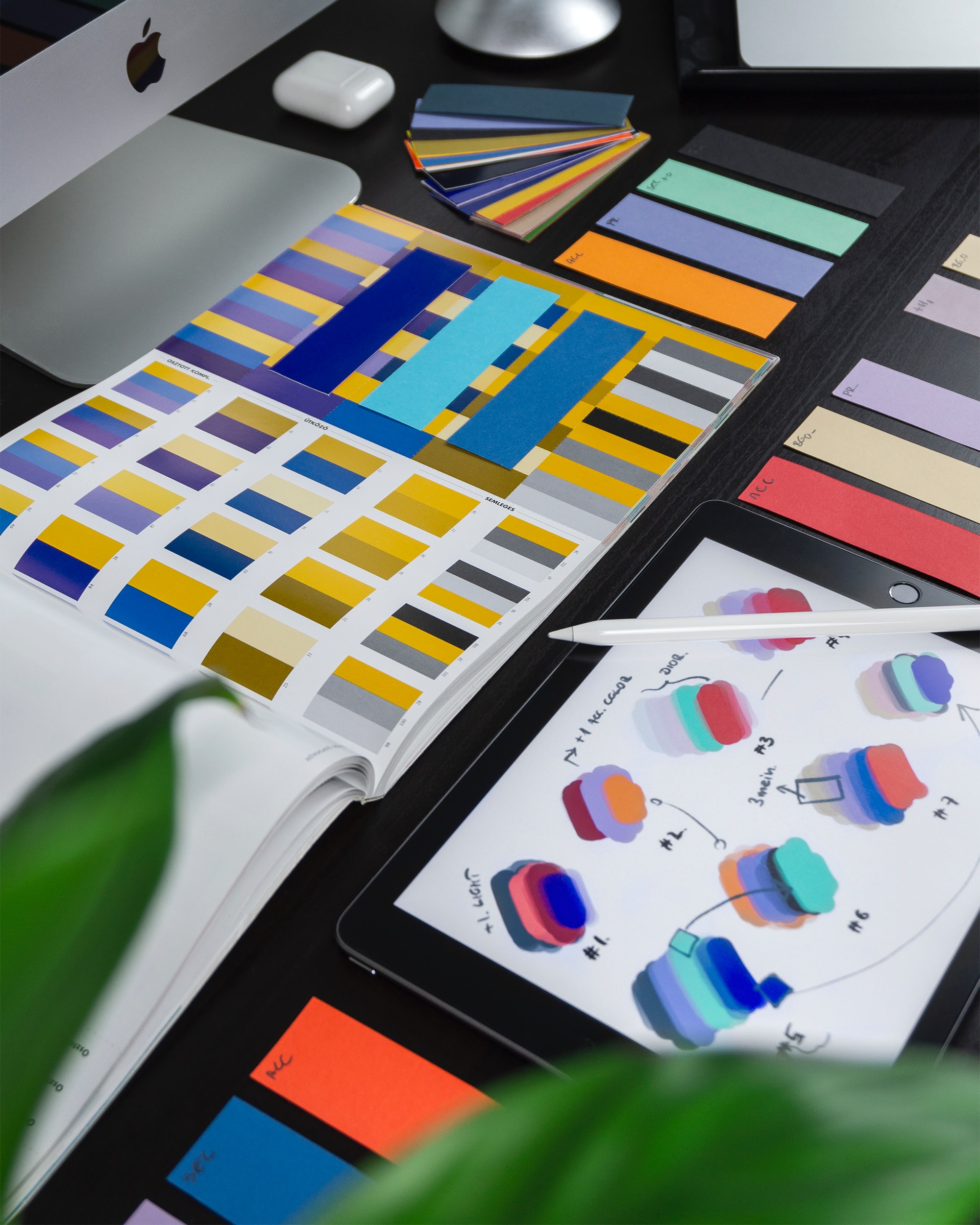
You can experiment with colors because it has been scientifically shown that they have a psychological impact on people! Unlike old websites from the 2000s, and later, where it was trendy to have a colorful, bright, and shiny visual representation of a website, nowadays it is the total opposite. Every web designer today will tell you that as long as you pick two or three colors, and stick with them, you won’t go wrong. Let the modern websites with huge traffic be the example for you – all of them are based on a solid color (grey and white mostly) for a background with a matching palette of two or three main colors that represent who they are. You should stick with this rule, too. Pick colors that get along with each other and pair them with the bright background.
3. Typography
There is nothing more attractive than scrolling down a website where the fonts are big, bold, and easy to read. On these websites, letters are very easily coherent as they emphasize the importance of something. Same as with the color schemes, the majority of large businesses have their own typefaces that they use to represent themselves – Adidas, Apple, Netflix, Spotify, and Reddit are perfect examples of this. Clean typography is vital for one website, and it includes suitable sized text (16 pixels and bigger), the best black and white ratio, grayscaling, and fitting fonts for the purpose. You should pay attention to the spacing between the letters for easier readability.
4. Optimization
Let’s be honest, we all close a website that takes too long to load. To avoid this happening to you with your visitors, you should pay special attention to its optimization. You can optimize images, find the fastest hosting provider, compress big files, implement the above-the-fold content (lazyload), enable caching, or improve server responsiveness in order to make the optimization as good as possible.
5. Mobile friendly
Did you know that more than half of internet traffic happens via smartphones and tablets?! If you are not stunned yet let us put it this way – you could lose more than half of your potential customers just because your website isn’t modified for smaller screens! Since we all use smartphones pretty much every day, you must take this opportunity and make your website available at any time. This can be accomplished by making your website mobile-friendly, resizing text, images, and action buttons to fit mobile screens, and making everything reachable and clearer when user scrolls on their mobile device.

6. Content is key
We listed five great elements when designing a website and explained how important they are, but we must not forget the actual content that is a key figure in the website’s traffic! Nothing beats good content. After all, the visitors are there because of it, and you should make the most out of it. Keep your content well written, interesting, direct, and concise.
7. Interactivity
Keeping visitors’ attention can be accomplished through various interactive elements such as interactive infographics, polls, animations, quizzes, surveys, sharing buttons, etc. This element can really be a game-changer and have a powerful impact on the traffic. With them, you can keep your visitors entertained and engaged. Interactivity and engagement can be used for more traffic, and therefore, more profit.
Conclusion
Here we have compiled some of the most important factors that directly affect your website’s modern design. Whether we have a website, or we are in the process of designing a new one, we should strive to make it simpler, eye adaptable, with the right color and typography, good looking on every device, and engage visitors through interactive elements.


